Feelinked
Role
Sole UX/UI Designer
Duration
4 weeks
Tool
Figma, After Effect, XD, Illustrator, Miro
Overview
Our body and mind are linked, so sometimes it is hard to know if you are mentally stressed or your body is. This app has come from the insight that you can manage your stress by controlling your physical reaction and the other way around. This app lets you quickly see how stressed you are and train your body to resist stress.
The design process
Discover
Competitive Analysis
I researched similar anxiety management mental health apps such as headspace, Calm, Sanvello, Loomi etc.
Focus point
Visual language
User flow
how meets the users need
Since many mental health apps serve as a bridge between users and therapists, the app is limited to writing down the list of anxiety and the close mental health care services. It can be helpful for someone who has time and the will to visit the clinic. However, for those who don't understand whether the symptom is from anxiety, they would need a different approach. Also, the treatment that many apps provide is limited to instruction videos. It doesn't show the effect directly to the users.
Data Collection
The data that I collected includes
Treatment for Anxiety
Data to check the anxiety level
What to consider when designing the mental health sector
Mental health can be sensitive, so I didn't want to display or use inaccurate data. Everyone can suffer from anxiety, but each of them is different. So I asked for an interview with a psychiatrist to check the information and discuss the treatment in more detail. The interview taught me that the mental health checklist online could help understand your status. Data like sleeping hours, steps, screen time, workloads, and deadlines can be unnecessary in determining one's anxiety level.
Define
User Persona
After competitive analysis, I listed the pain points of the potential users. Most mental health apps have a self-checking test but lack physical symptoms check and user interaction. I have interviewed potential users suffering from multiple projects and lacking sleep. Through the interview, I created the target user’s age and persona.
User Journeys
User journeys allow me to map out how users find the app and how to make them keep using it and drag more users.
MVP (Minimum Viable Product)
The MVP helped me build the app and quickly test my design drafts on users. First, I listed the needs to design my app. Those features are selected based on the persona. Based on those researches I selected these functions that should be in the MVP.
User flow diagram
Develop
Wireframe
Prototype
User Testing
Deliver
The testing was done by 15 people in the Graphic design course students. For the first user test, I asked the users to perform a specific task with the device I brought. But that didn’t work as the other users were queuing for the testing. So for the second test, I sent the prototype link to them and asked them to perform it on their own device. Based on their answer, I changed some visual language and simplified the user flow.
Test objectives
To see if the users aren’t bored with the explanation part
To see if they can navigate
To see if they feel relaxed after the training
Task
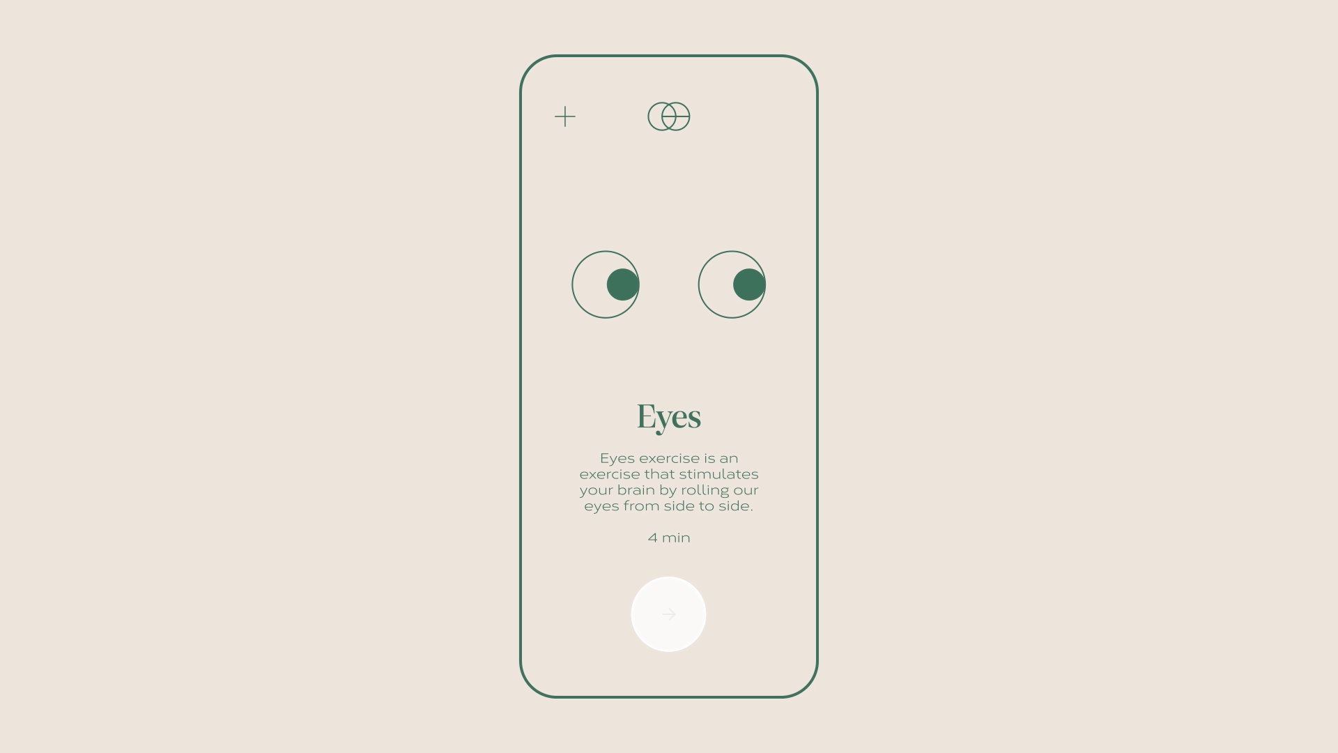
Perform Eye rolling training
Go to ‘Find a Doctor’ page
Questions
Was it easy to navigate?
How are you feeling after the training?
Design System
When choosing a Font, I considered whether it has many family fonts and whether it is readable. Cobert font is clean, readable and not too serious like the other san serif fonts. Also, it is wide, so it gives a stable visual language.
The colour scheme is significant when it decides most of the atmosphere of the app. As this is a mental well-being app, I chose a calm colour but not dark. I chose green as the primary colour for the prototype, but the saturation was too high to give a calm vibe. So I changed the colour scheme to more muted colours.


